Project Description
I collaborated with the Cleveland Institute of Art’s marketing team to design a Pride parade T-shirt and a set of branded stickers for distribution during Cleveland Pride. The project focused on creating vibrant, inclusive visuals that celebrated the LGBTQIA+ community while reflecting the creativity of CIA’s student body.
______________________________
Tools
Adobe Photoshop • Adobe Illustrator
Adobe Photoshop • Adobe Illustrator
User
The Cleveland Institute of Art (CIA) is a private college of art and design. The primary audience included CIA students participating in the Cleveland Pride parade, along with community members and event attendees engaging with the school through Pride-related outreach.
The Cleveland Institute of Art (CIA) is a private college of art and design. The primary audience included CIA students participating in the Cleveland Pride parade, along with community members and event attendees engaging with the school through Pride-related outreach.
Problem
CIA needed Pride merchandise that authentically represented both the LGBTQIA+ community and the artistic identity of the institution. The designs had to be visually bold, inclusive of Pride colors, and adaptable for both apparel and sticker formats.
CIA needed Pride merchandise that authentically represented both the LGBTQIA+ community and the artistic identity of the institution. The designs had to be visually bold, inclusive of Pride colors, and adaptable for both apparel and sticker formats.
Needs
The client required a T-shirt design that incorporated the full Pride color spectrum and aligned with CIA’s creative culture. They also needed engaging sticker designs that could be handed out during the parade to increase visibility and create a memorable, celebratory presence.
The client required a T-shirt design that incorporated the full Pride color spectrum and aligned with CIA’s creative culture. They also needed engaging sticker designs that could be handed out during the parade to increase visibility and create a memorable, celebratory presence.

Process
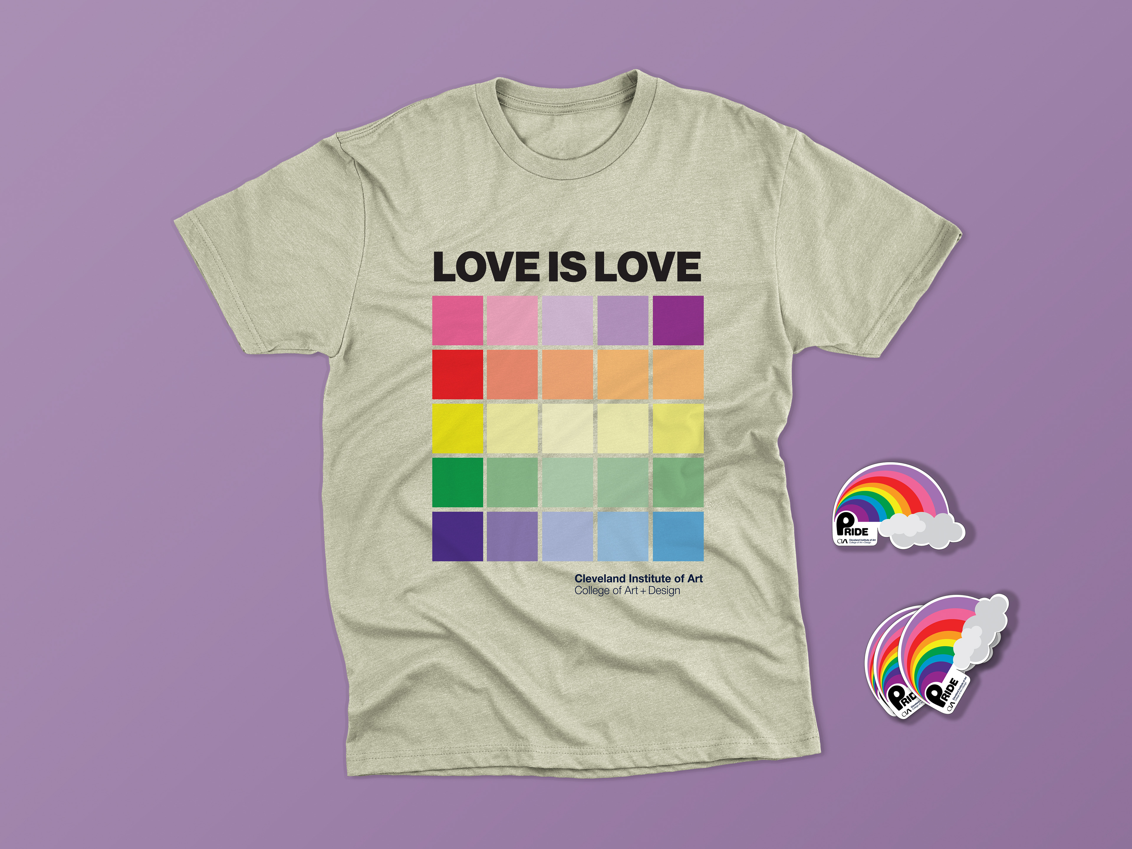
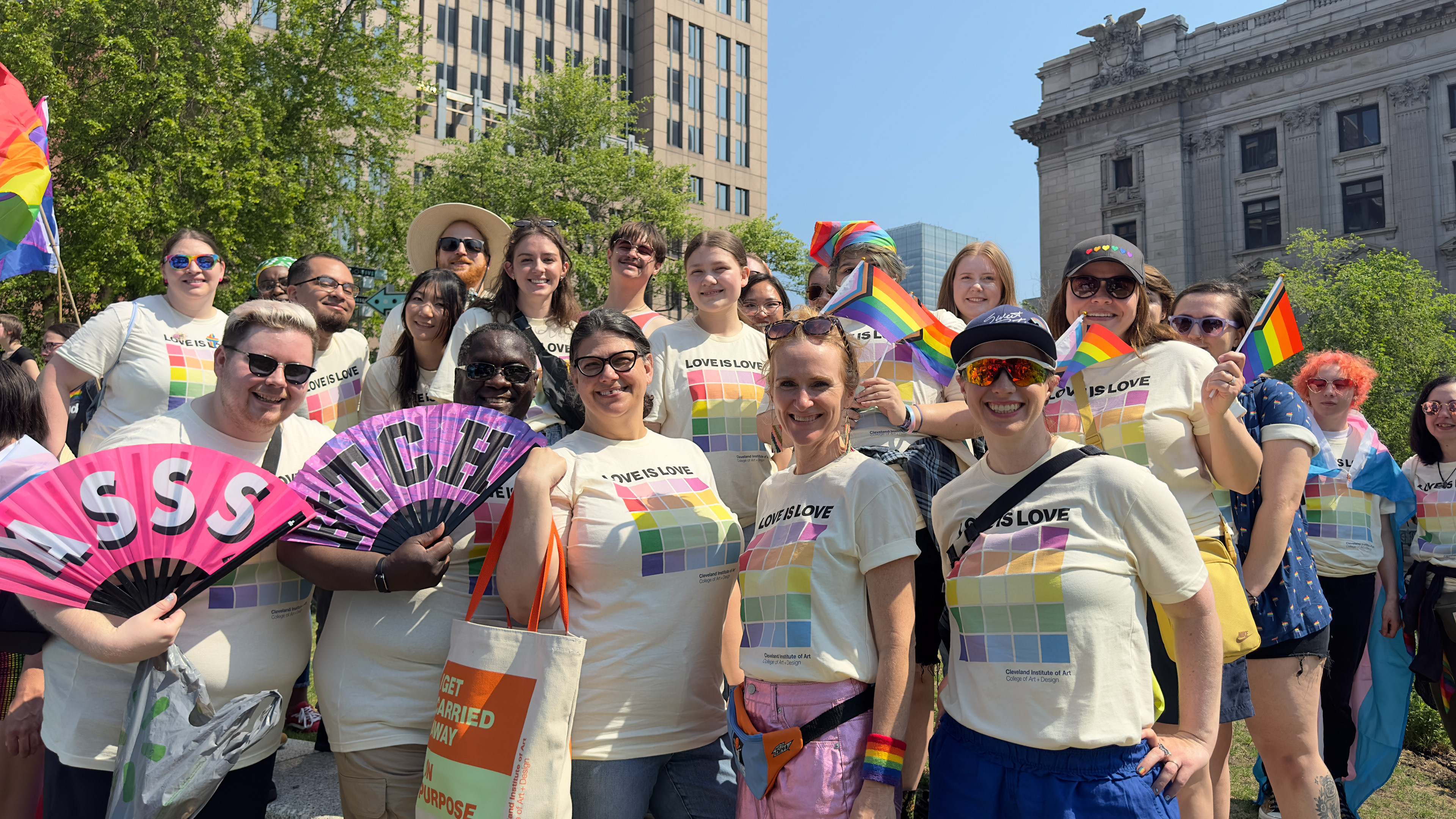
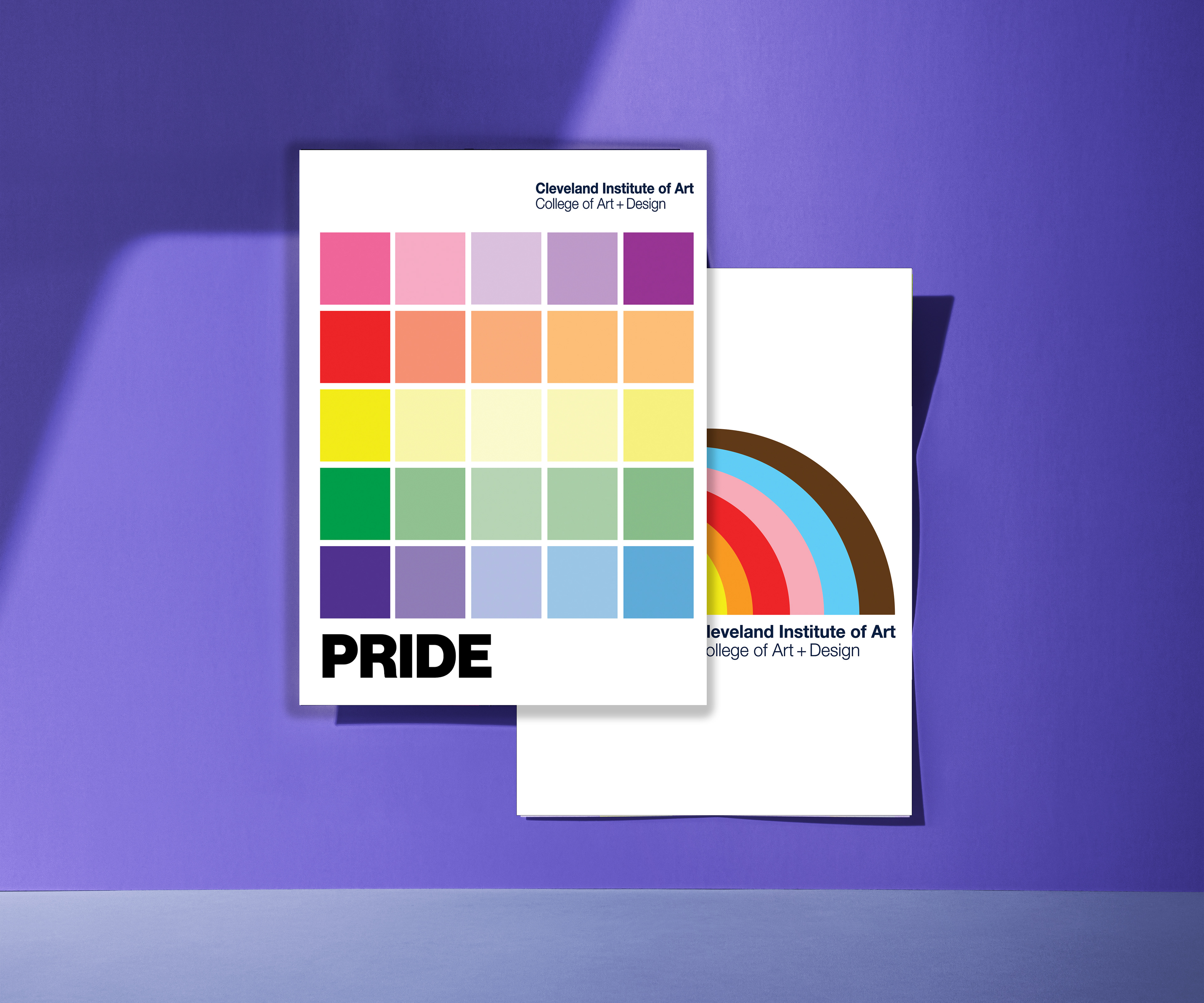
I worked closely with the marketing team to brainstorm visual directions using simple shapes, color systems, and pattern exploration. Two T-shirt concepts were developed, both incorporating the full Pride palette.
The first concept drew inspiration from color swatching and mixing charts, reflecting the foundational creative processes CIA students use in their artistic practice. The second concept featured a simplified rainbow composition paired with the CIA logo for a more direct, bold Pride statement.
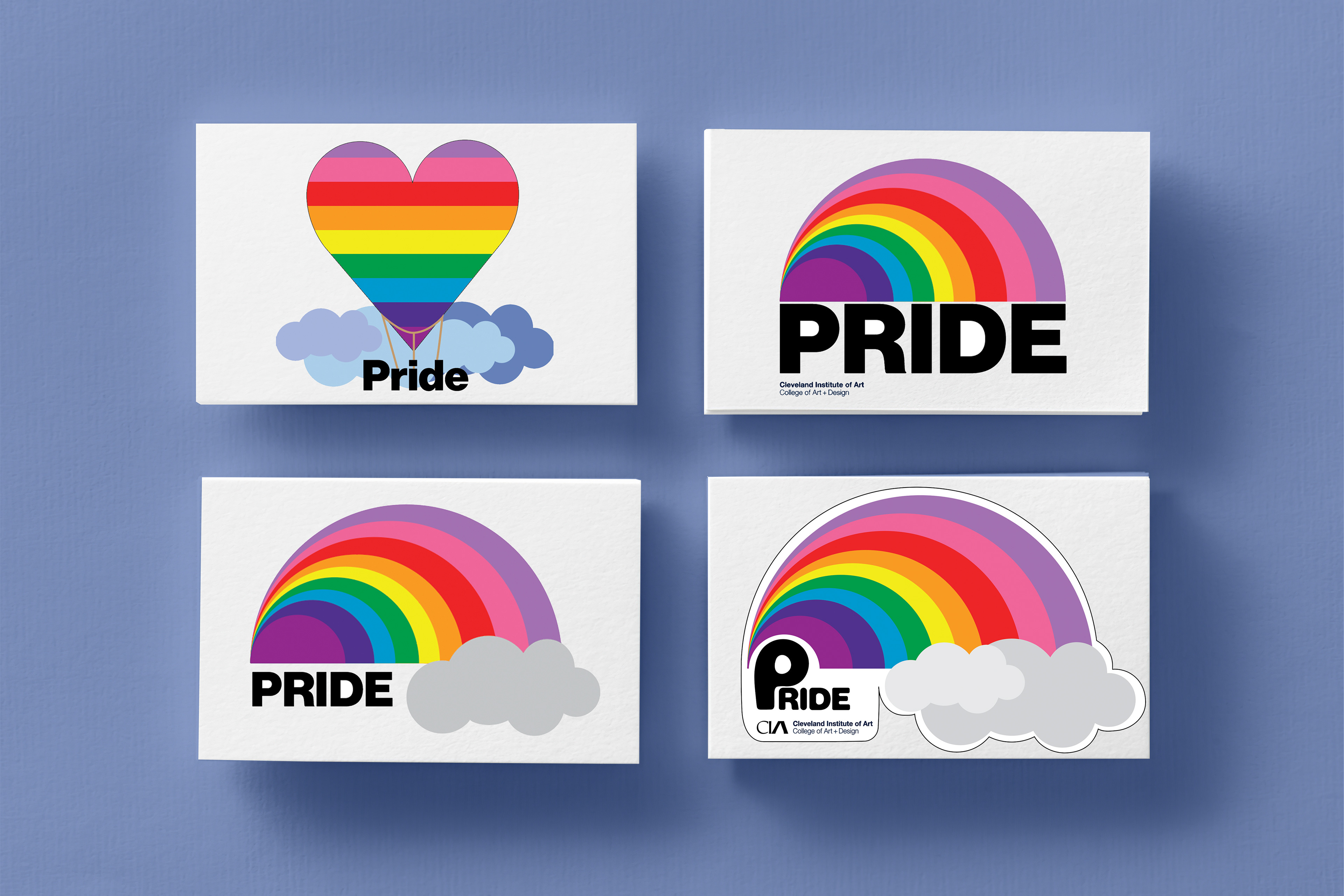
In addition to the apparel design, I developed a series of Pride stickers. This process began with visual research and curation of playful, energetic elements. I focused on creating a lively layout that captured the celebratory spirit of Pride while maintaining brand recognition.
______________________________
Skills
Brand expression • merchandise design • color theory application • visual storytelling • collaborative ideation • print production preparation • multi-format design adaptation.
Brand expression • merchandise design • color theory application • visual storytelling • collaborative ideation • print production preparation • multi-format design adaptation.
Roadblocks
The main challenge was ensuring the designs felt celebratory and inclusive while still clearly reflecting CIA’s identity as an art and design institution. The artwork also needed to translate effectively across different materials and production methods, requiring careful attention to color balance and layout clarity.
The main challenge was ensuring the designs felt celebratory and inclusive while still clearly reflecting CIA’s identity as an art and design institution. The artwork also needed to translate effectively across different materials and production methods, requiring careful attention to color balance and layout clarity.
Project Assessment
This project highlighted the importance of aligning institutional branding with community celebration. By grounding the visuals in artistic process and color exploration, the designs felt both meaningful to students and visually engaging for a public event.
This project highlighted the importance of aligning institutional branding with community celebration. By grounding the visuals in artistic process and color exploration, the designs felt both meaningful to students and visually engaging for a public event.
Solution
CIA selected the color swatch–inspired design for the T-shirt and one of the energetic sticker layouts to accompany it. The chosen designs balanced Pride representation with a nod to the creative process central to CIA’s curriculum.
Final production files were prepared and delivered to vendors. The T-shirts were printed using plastisol inks on neutral cotton fabric, and the stickers were produced with semi-permanent adhesive vinyl and custom contour cuts.
______________________________
Impact
The merchandise helped CIA show visible support for the LGBTQIA+ community while strengthening school pride among students participating in the parade. The cohesive visual system across apparel and stickers created a recognizable and celebratory presence during the event.
The merchandise helped CIA show visible support for the LGBTQIA+ community while strengthening school pride among students participating in the parade. The cohesive visual system across apparel and stickers created a recognizable and celebratory presence during the event.
Goals Achieved
Delivered inclusive, brand-aligned Pride merchandise that celebrated both community identity and student creativity. Successfully translated designs across apparel and sticker formats for large-scale public engagement.
Delivered inclusive, brand-aligned Pride merchandise that celebrated both community identity and student creativity. Successfully translated designs across apparel and sticker formats for large-scale public engagement.
Takeaways
This project reinforced how design can celebrate identity while staying rooted in institutional voice. I strengthened my ability to create flexible visual systems for merchandise and learned more about preparing artwork for specialty print production.
This project reinforced how design can celebrate identity while staying rooted in institutional voice. I strengthened my ability to create flexible visual systems for merchandise and learned more about preparing artwork for specialty print production.