Project Description
I designed the seasonal packaging system for Dreamland, a summer decor collection launched at JOANN Fabrics. The project focused on translating an early 90s aesthetic into a cohesive retail presence.
______________________________
Tools
Adobe Photoshop • Adobe InDesign
Adobe Photoshop • Adobe InDesign
User
The primary audience consisted of JOANN Fabrics customers looking for nostalgic, trend-forward summer decor. The line appealed to millennial and Gen Z shoppers drawn to the "vaporwave" and 90s revival aesthetics.
The primary audience consisted of JOANN Fabrics customers looking for nostalgic, trend-forward summer decor. The line appealed to millennial and Gen Z shoppers drawn to the "vaporwave" and 90s revival aesthetics.
Problem
JOANN needed a packaging system that felt distinct from its standard floral or rustic summer lines. The challenge was to create a visual language that felt nostalgic yet modern, ensuring the products stood out in a crowded retail environment.
JOANN needed a packaging system that felt distinct from its standard floral or rustic summer lines. The challenge was to create a visual language that felt nostalgic yet modern, ensuring the products stood out in a crowded retail environment.
Needs
The collection required a versatile color palette and pattern system that could be applied across various dielines. The client needed the packaging to feel premium and "giftable" while maintaining the vibrancy of the 90s-inspired product colors.
The collection required a versatile color palette and pattern system that could be applied across various dielines. The client needed the packaging to feel premium and "giftable" while maintaining the vibrancy of the 90s-inspired product colors.
Process
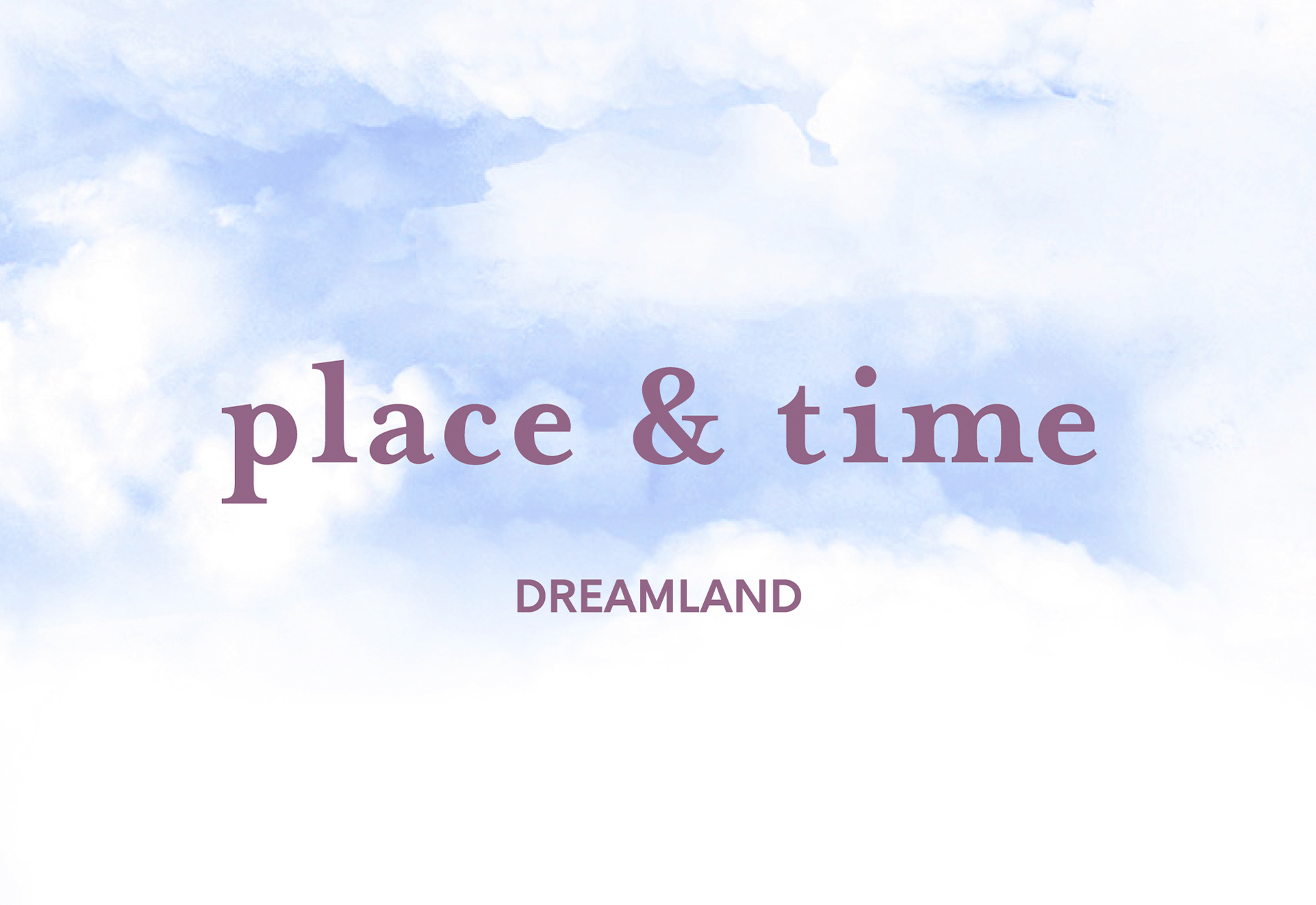
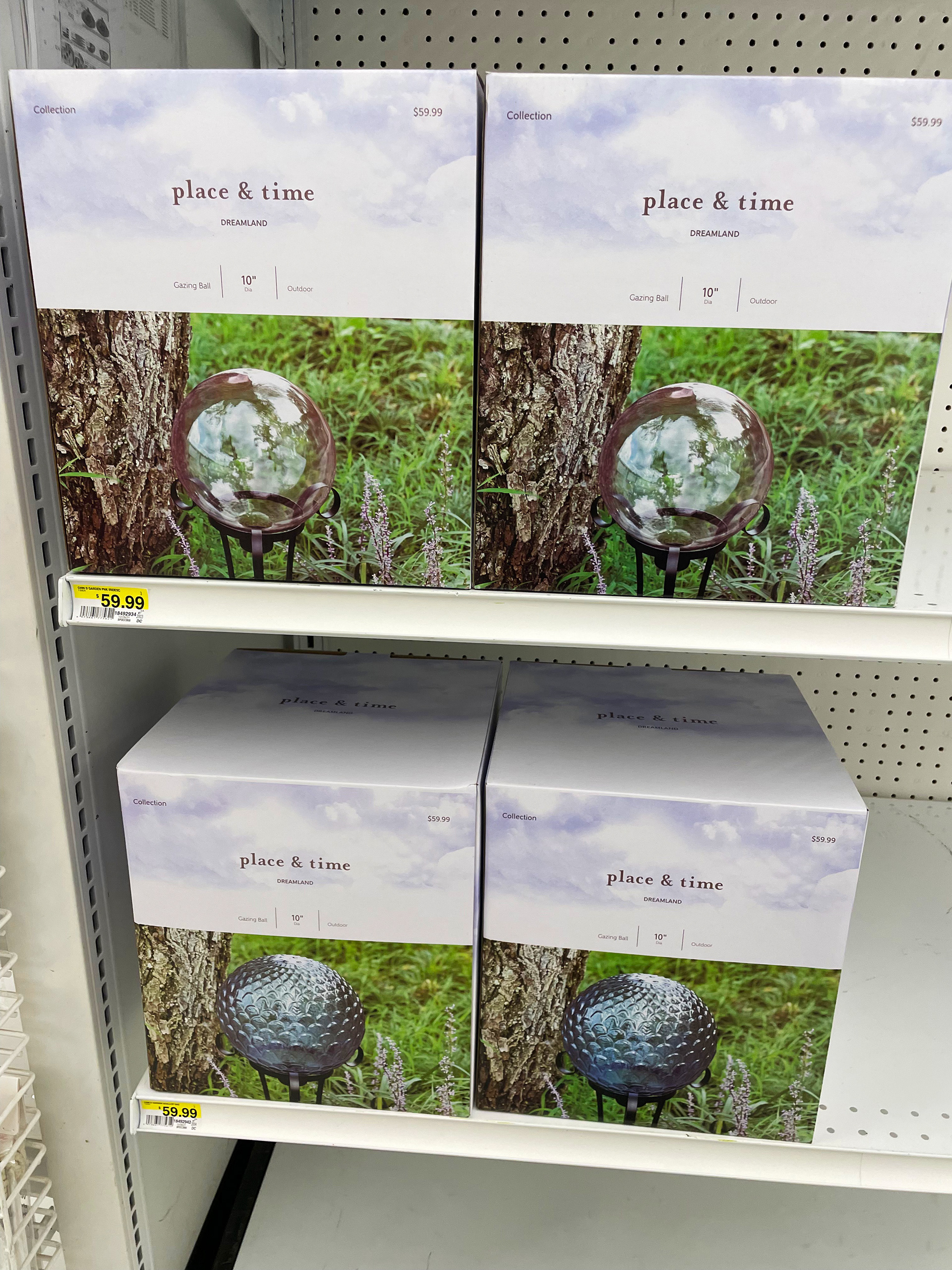
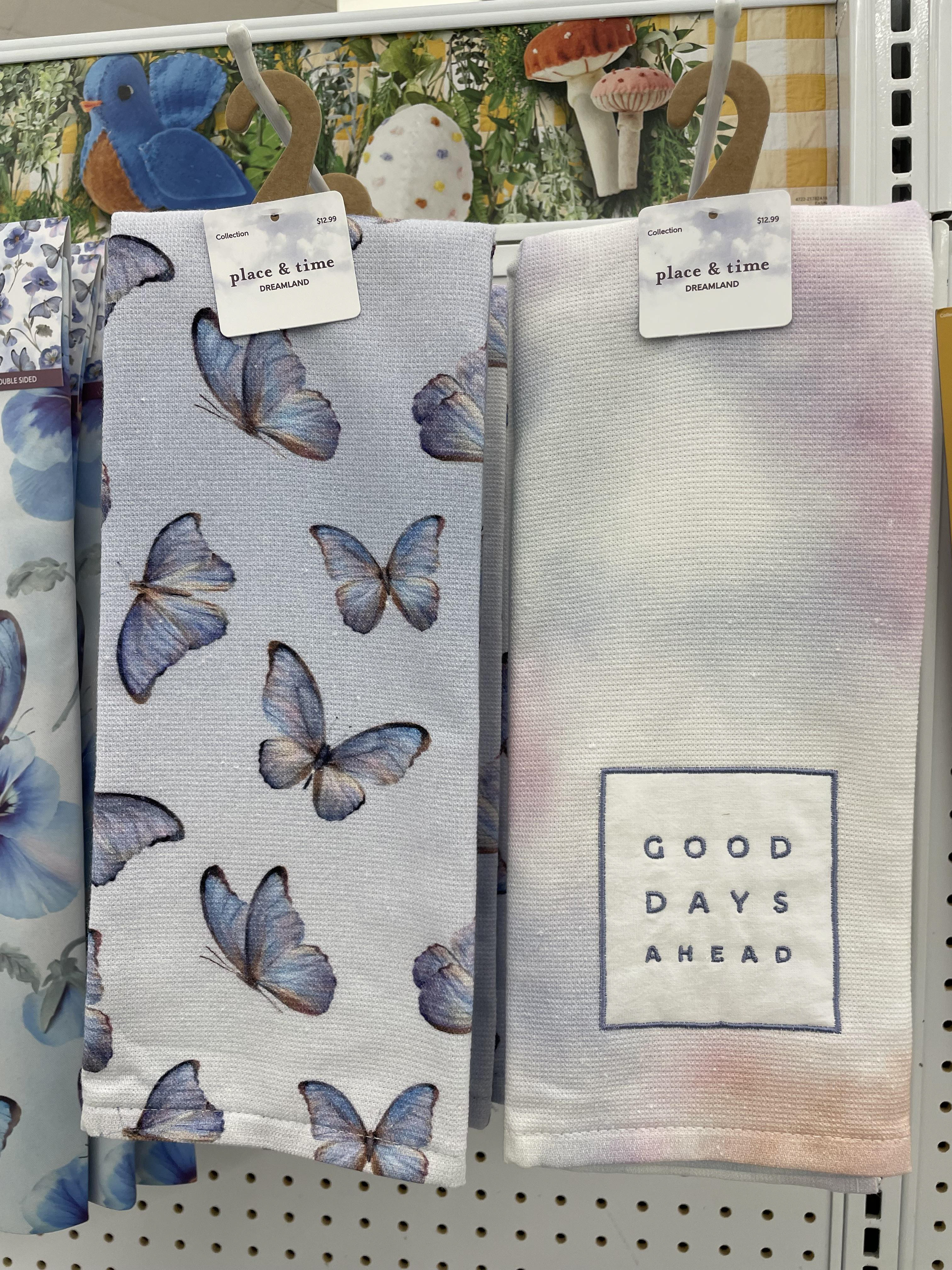
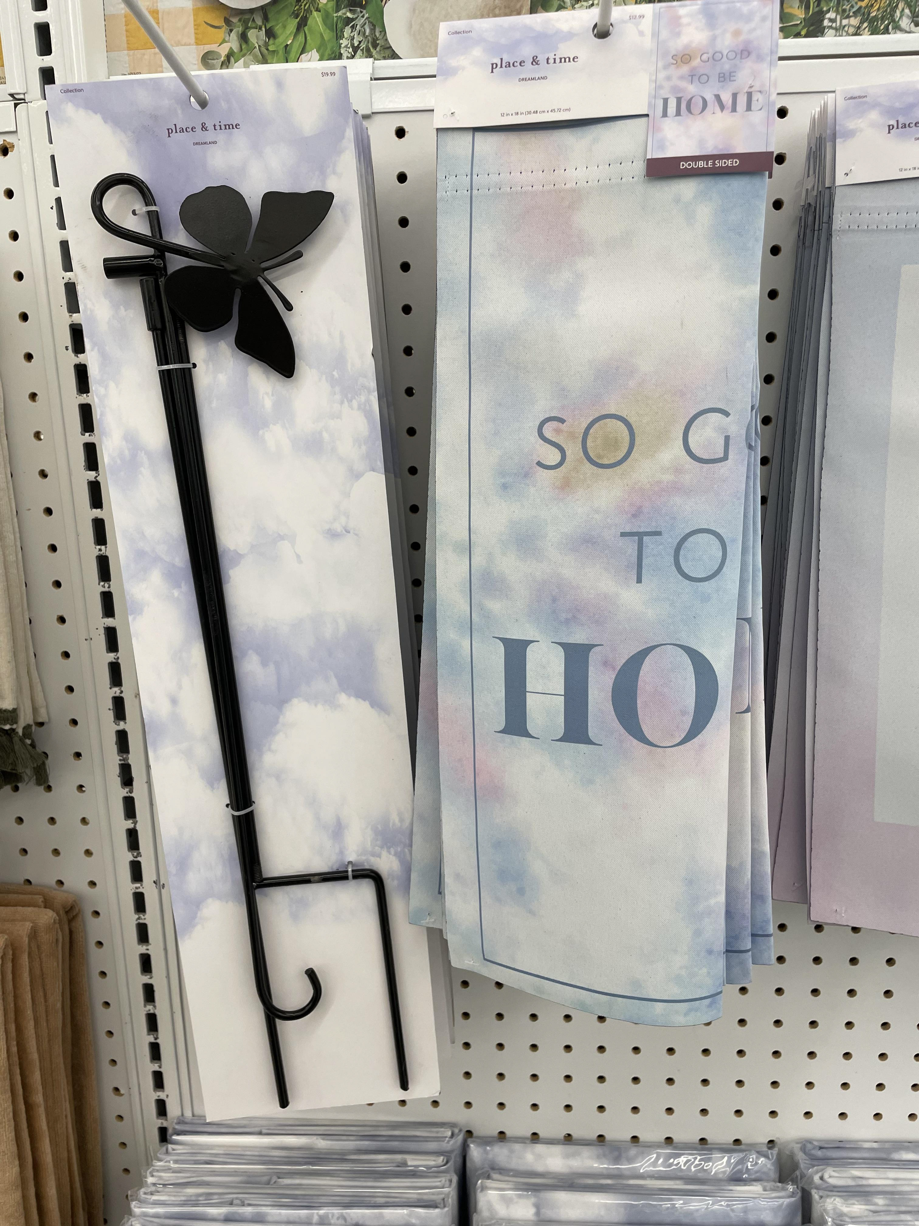
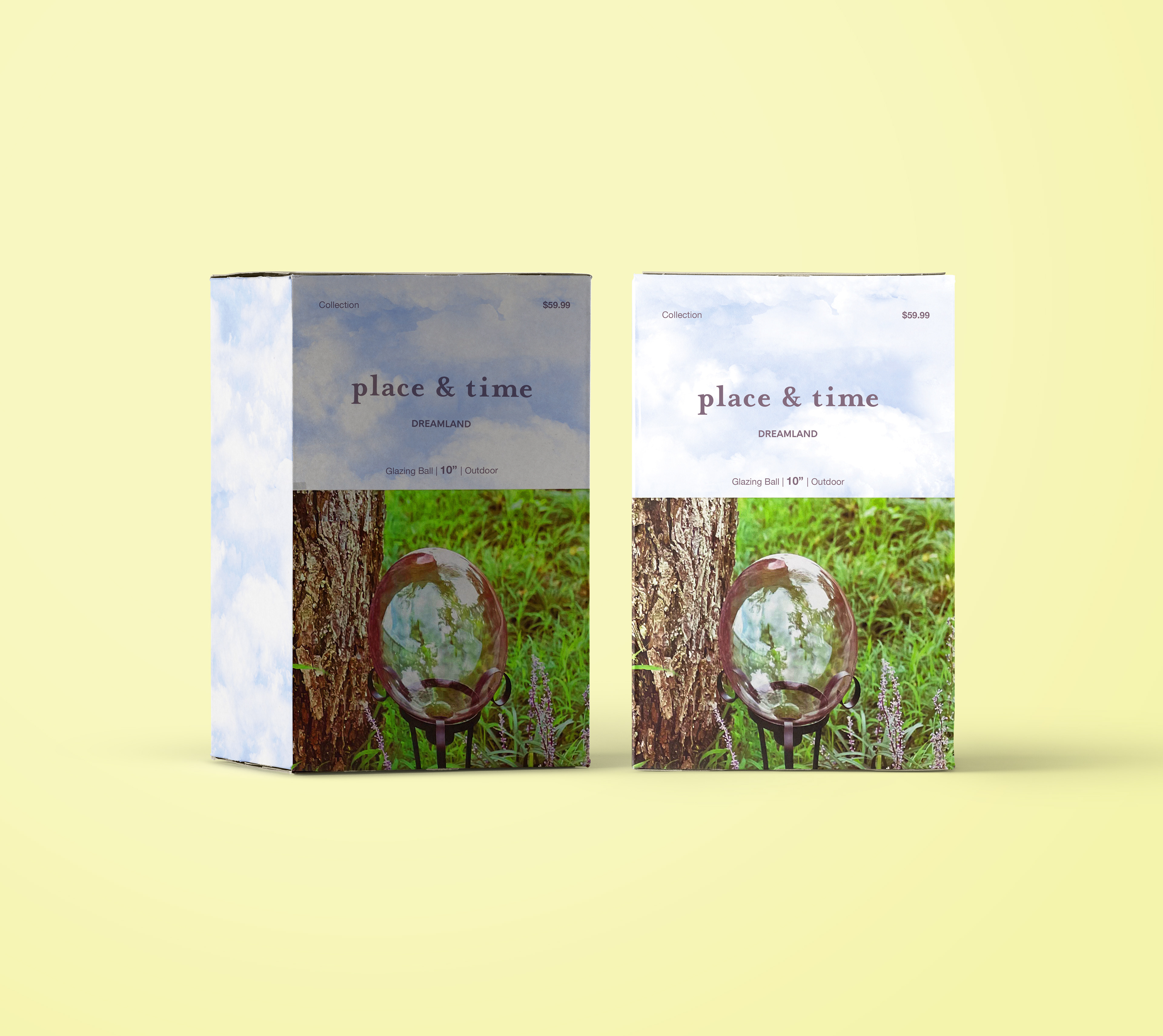
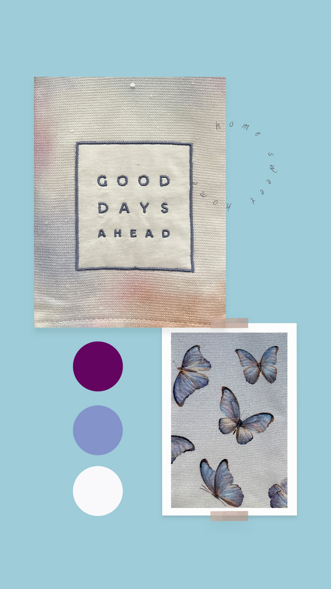
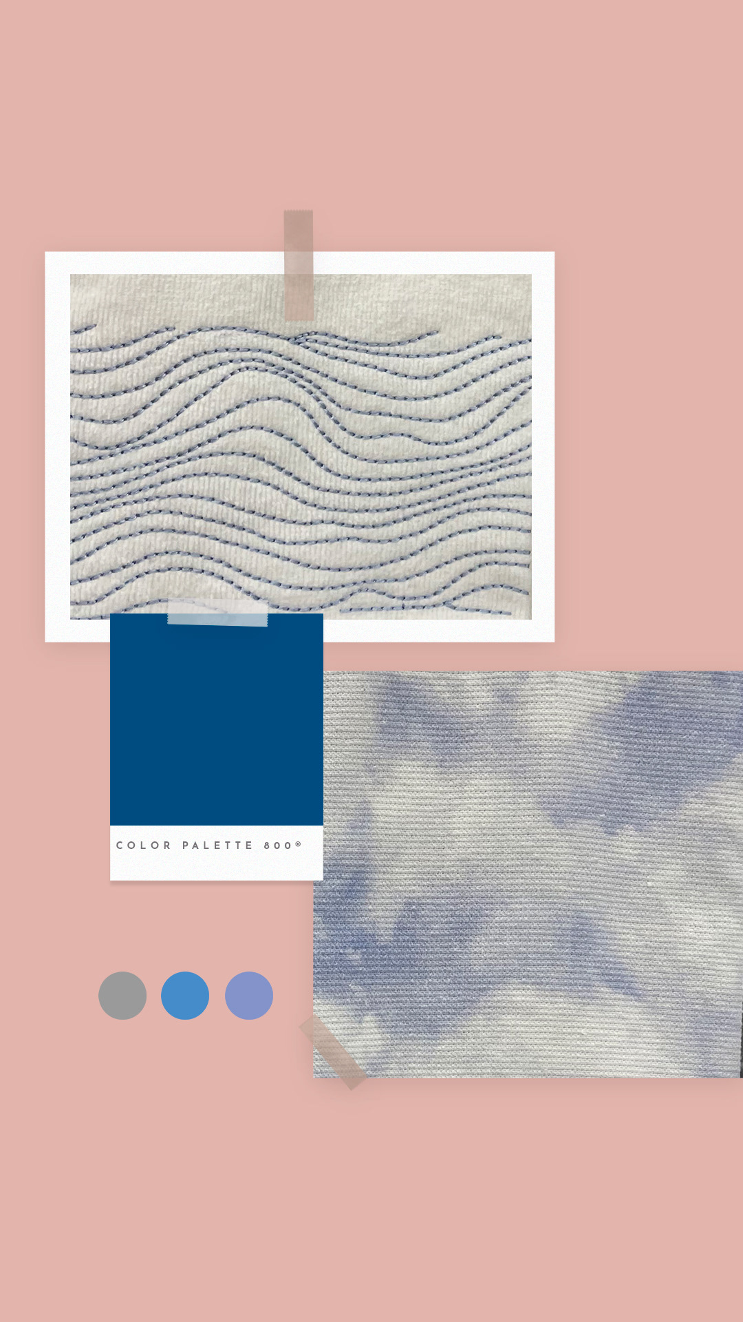
I began by curating mood boards centered on 90s trends, collaborating closely with the buying and product development teams to ensure alignment with the upcoming product line-up. I developed a color system featuring pale blue tones contrasted with deep navy and rich maroons.
To unify the collection, I designed a custom cloud pattern applied throughout the packaging. A key creative pivot was the decision to use a gloss finish rather than JOANN’s standard soft matte. I advocated for this change to create an iridescent aesthetic that complemented the products and allowed the lighter colors to remain vibrant under retail lighting.
______________________________
Skills
Packaging design • trend forecasting • color theory • vendor collaboration • print production management • brand extension • technical dieline preparation.
Packaging design • trend forecasting • color theory • vendor collaboration • print production management • brand extension • technical dieline preparation.
Roadblocks
A significant challenge was deviating from the established brand standard of matte finishes. This required justifying how a gloss finish would better serve the specific "Dreamland" aesthetic and product materials to stakeholders.
A significant challenge was deviating from the established brand standard of matte finishes. This required justifying how a gloss finish would better serve the specific "Dreamland" aesthetic and product materials to stakeholders.
Project Assessment
This project demonstrated the value of trend-based design in the craft and hobby sector. By pushing for a non-standard finish (gloss), the final result achieved a level of visual depth and "shimmer" that a standard matte finish could not have provided.
This project demonstrated the value of trend-based design in the craft and hobby sector. By pushing for a non-standard finish (gloss), the final result achieved a level of visual depth and "shimmer" that a standard matte finish could not have provided.
Solution
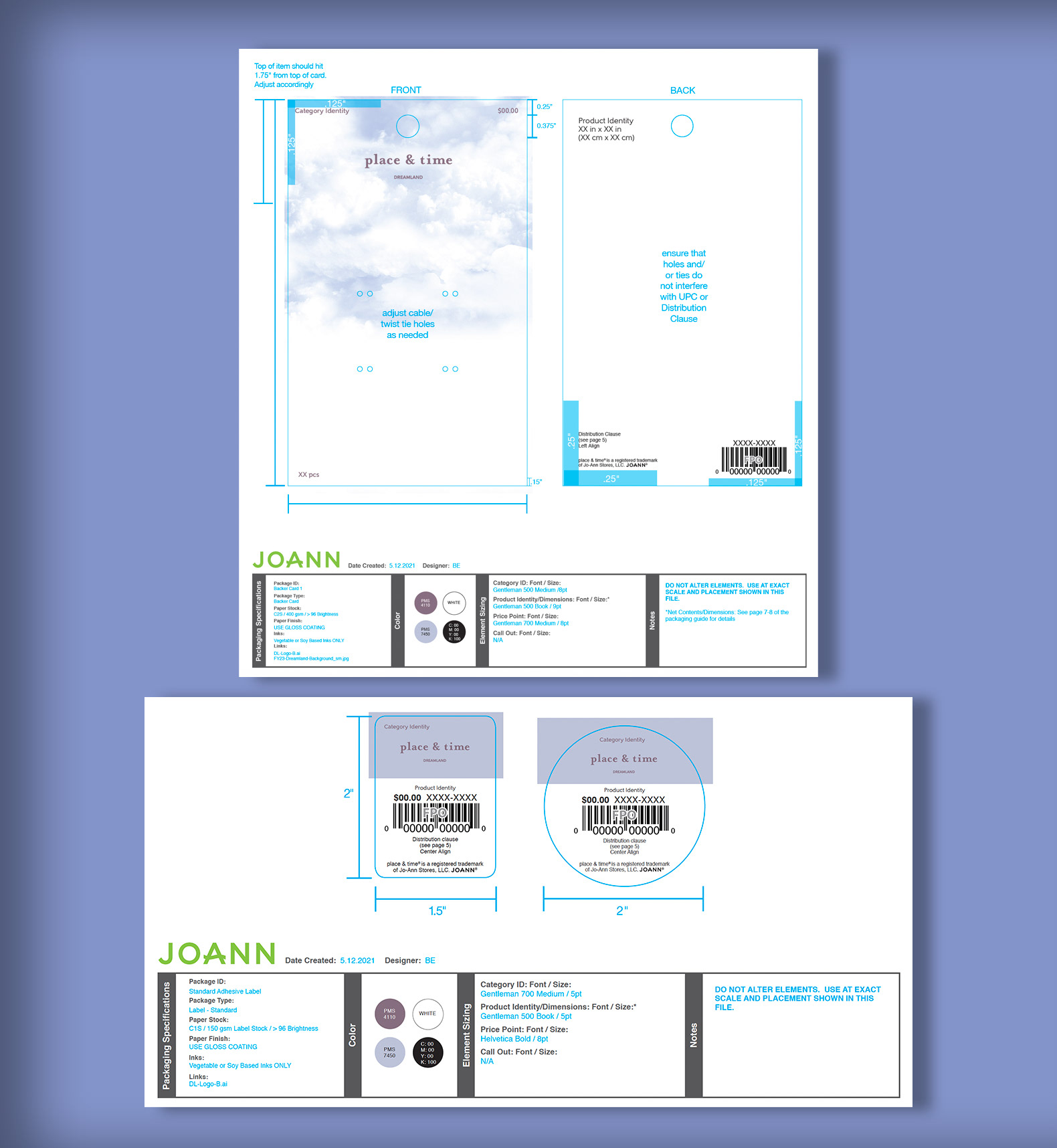
The final solution utilized the cloud pattern and the blue-maroon color palette across a wide variety of product shapes and sizes. I was responsible for the technical execution, including fact-checking all dimensions, legal warnings, and product call-outs.
______________________________
Final production
Final art was applied to various vendor-specific dielines. I reviewed and approved all physical samples and materials with multiple vendors to ensure color consistency across different substrates.
Final art was applied to various vendor-specific dielines. I reviewed and approved all physical samples and materials with multiple vendors to ensure color consistency across different substrates.
Impact
The Dreamland collection provided a fresh, nostalgic aesthetic for the summer season, successfully capturing a younger demographic for JOANN. The iridescent, glossy look created a cohesive "boutique" feel across the entire product line.
The Dreamland collection provided a fresh, nostalgic aesthetic for the summer season, successfully capturing a younger demographic for JOANN. The iridescent, glossy look created a cohesive "boutique" feel across the entire product line.
Goals Achieved
Successfully launched a trend-driven seasonal line • established a unique visual identity through custom patterns and specialty finishes • managed end-to-end production with global vendors.
Successfully launched a trend-driven seasonal line • established a unique visual identity through custom patterns and specialty finishes • managed end-to-end production with global vendors.
Takeaways
This project reinforced the importance of advocating for creative decisions (like finish types) that enhance the product's story. It also sharpened my technical skills in managing complex legal and dimensional requirements across a large-scale product launch.
This project reinforced the importance of advocating for creative decisions (like finish types) that enhance the product's story. It also sharpened my technical skills in managing complex legal and dimensional requirements across a large-scale product launch.