Awakening | a runway show
The Cleveland Institute of Art was planning a runway show called Awakening. This show was a collaboration of student art work amidst various mediums that examined the process from dark to light, a reflection of coming to the end of the pandemic. A brochure design was requested for this event that resembled key element from the Baroque era.
Process
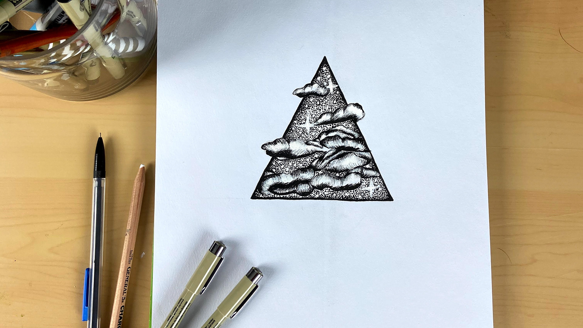
I stared by researching symbols used in the Baroque era, and came up with a floral motif illustration using rich reds and blues that were popular during that time period. Once I completed the layout I pulled my illustration into photoshop to manipulate the illustration to look as if there was light running through it. I was able to work with the client of font types and pairings to complete the design.
Once the layout was completed I pulled my illustration into photoshop to manipulate the illustration to look as if there was light running through it. I was able to work with the client of font types and pairings to complete the design.
The typographical preference specified by the client was to stick to a script font for the title. After reviewing options and styles it was decided to move forward with font Altesse Std. To connect the font to the runway show, I applied a satin texture as a nod to silk fabrics textures, which would be seen during the show.
Solution
The Awakening program was designed and produced as a bi-fold pamphlet handed out to all audience attendees.

Final front

Final inside

